
Businesses spend money on ads to bring visitors to their website, then lose most of those visitors in seconds. The page is slow, the message is unclear, the phone number is hard to find, or the form asks for too much. A landing page is the bridge between your marketing and your sales. If the bridge is weak, every rupee you spend on ads is partly wasted.
Here is the structure I use for landing pages that turn visitors into enquiries.
Key takeaways
- A landing page should have one goal and one primary call to action.
- The headline must match the promise of the ad or link that brought the visitor.
- Show proof — reviews, results, logos or photos of real work — near the top.
- Keep forms short and make contacting you on WhatsApp or phone effortless.
- Test one change at a time and measure the conversion rate.
What a landing page is
A landing page is a page designed for one goal: getting the visitor to take a specific action, such as calling, messaging on WhatsApp, booking a demo or filling a form. Unlike a home page, which serves many purposes, a landing page removes distractions and focuses on one offer.
1. A headline that matches the ad
When someone clicks an ad for "Spoken English classes in Lucknow — free demo", the page must immediately confirm they are in the right place. The headline should repeat the core promise: "Spoken English Classes in Lucknow — Book Your Free Demo Class". Mismatched messages cause visitors to leave.
2. A clear subheadline and offer
Below the headline, explain the main benefit and offer in one or two lines: "Small batches, experienced trainers, weekend and evening options. Try a class free before you join." Be specific. Vague promises like "best quality services" mean nothing.
3. A strong call to action above the fold
On a mobile screen, the visitor should see a button without scrolling: "Book Free Demo", "Get Price on WhatsApp" or "Call Now". In India, a WhatsApp button often converts better than a form because it feels personal and easy. Offer both where possible.
4. Benefits, not just features
List three to five benefits in short points with simple icons. Features describe what you have; benefits describe what the customer gains. "Batches of 10" is a feature; "personal attention for every student" is a benefit.
5. Proof and trust
Visitors need reasons to believe you:
- Genuine reviews and testimonials, ideally with names and photos (with permission).
- Ratings from Google or other platforms.
- Years in business or number of customers served, if accurate.
- Photos of your real team and premises.
- Certifications or registrations relevant to your industry.
Never invent reviews or numbers. Fake proof damages trust permanently.
6. Answer objections
Think about why people hesitate — price, location, timing, quality, trust — and answer those concerns on the page with a short FAQ section. This reduces the questions your sales team must handle and increases confidence.
7. A short form
If you use a form, ask only what you need: name, phone number and perhaps one qualifying question. Every extra field reduces submissions. You can gather more details during the first conversation.
8. Speed and mobile design
Most Indian visitors arrive on mobile phones, often on variable connections. A landing page should load in under three seconds. Compress images, avoid heavy sliders and unnecessary scripts, and test on a real phone. Speed improvements often increase conversions noticeably. My article on website speed and Core Web Vitals explains the technical side.
9. Remove distractions
Remove the main navigation menu, unrelated links and multiple competing offers. Every link that is not your call to action is an exit.
10. Track and test
Install conversion tracking so you know how many visitors take action. Then test one change at a time: a different headline, button text, image or offer. Small improvements compound. A page that converts at 6 per cent instead of 3 per cent halves your cost per lead without changing your ad budget.
A simple landing page outline
- Headline + subheadline + primary button.
- Hero image or short video of the real business.
- Three to five benefits.
- Testimonials and ratings.
- How it works — three simple steps.
- FAQ answering common objections.
- Final call to action with WhatsApp and call options.
- Footer with address and contact details.
After the click: speed of response
The landing page creates the enquiry; your team converts it. Make sure every enquiry receives an immediate acknowledgement and a quick personal response. See automating lead follow-up.
Anatomy of a high-converting landing page
| Section | Purpose |
|---|---|
| Headline and subheadline | Confirm the visitor is in the right place and state the main benefit |
| Hero image or video | Show the product, service or result |
| Primary call to action | One clear next step above the fold |
| Benefits | Three to five outcomes the customer cares about |
| Proof | Reviews, case results, certifications you genuinely hold |
| Offer details | What is included, price or starting price, guarantee |
| FAQs | Answer objections before they stop the sale |
| Final call to action | Repeat the next step at the end |
Speed and mobile first
Most visitors arrive on mobile phones, often on variable networks. Compress images, avoid heavy scripts, use readable font sizes and large buttons, and make sure the call to action is visible without scrolling. A page that loads in a couple of seconds converts far better than one that loads slowly. See website speed and Core Web Vitals.
Testing ideas
Test headlines, the main image, the offer, form length, button text and the placement of reviews. Change one element at a time and run the test long enough to gather meaningful data before deciding.
A 7-step landing page build
- Define one goal and one audience for the page.
- Write a headline that states the main benefit clearly.
- Add a short explanation, key benefits and proof such as testimonials.
- Place one clear call to action above the fold and repeat it.
- Keep forms short and mobile-friendly.
- Ensure the page loads fast on mobile networks.
- Test one change at a time and measure conversion rate.
Frequently asked questions
What is a good landing page conversion rate?
It varies widely by industry, offer and traffic source. Focus on improving your own baseline month by month.
Should a landing page have navigation menus?
Usually minimal or none, to keep visitors focused on the single goal.
How long should a landing page be?
Long enough to answer the visitor's questions. High-value services often need more detail than simple offers.
Can I build landing pages without coding?
Yes. Many website builders and landing page tools offer templates; ensure they load fast and track conversions.
Should a landing page have navigation menus?
Often no. Removing distractions keeps visitors focused on the single goal.
How long should a landing page be?
Long enough to answer key questions. Simple offers need short pages; complex or expensive offers need more detail and proof.
Final thought
A great landing page is clear, fast, trustworthy and focused. It respects the visitor's time and makes the next step obvious. Build one for each major offer, and your advertising will work much harder. For website and landing page development, explore DND Teams, and read more on the marketing expert page.
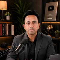
Jitendra Wadhwani
Global Entrepreneur · AI & Tech Expert · Digital Marketing & SEO · International Business Coach
Jitendra Wadhwani is an Indian businessman and global entrepreneur who leads HYRAX COMMUNICATION PVT LTD, a 15 years trusted company, and its ventures DND Teams, Viral In City and A Property Agency. He works as an AI and tech expert, digital marketing, social media and SEO expert, international business coach, trainer and YouTuber, serving clients and audiences across India, the USA, UK, UAE, Europe and worldwide. Everything he writes comes from hands-on work with real businesses, creators and learners.